Table of Contents
The Grey White Balance Colour Card: an X-Rite clone
GWBCC is a series of products manufactured by an UK company; they are color checkers to be used in photographic color calibration. They have a certain notoriety for the fact that they cost half or a quarter of other much more famous products. In March 2019 I purchased for about 22 € the 2in1 model, a 140×88 mm plastic card which has the 24 color swatches on one side and a three grays target on the other.
Here I share my experience using that card to do color calibration of photographies and images acquired using a scanner. The workflow is entirely based on free and open source software: Debian GNU/Linux operating system, The GIMP as image processing software and Darktable for color calibration.
The final word is: despite the product lacks a real color calibration, some results can be obtained at the cost of a lot of preparatory work, but without any claim of objective precision.
The ColorChecker and its Clones
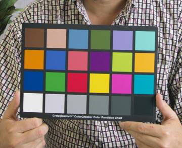
The ColorChecker is a registered trademark of a color chart introduced in 1976 and manufactured by Macbeth, now X-Rite; it features 24 squared patches of various colors. The colors were choosen quite arbitrarly: six shades of gray, some primary colors (red, green, blue, cyan, magenta, and yellow) and other colors of natural objects, like skin tones, foliage, etc.
There are several manufacturers that sell similar (cloned) color charts; they are more or less compatible with the X-Rite original, where compatibility is measured on the precision obtainable using the same software procedures calibrated on the X-Rite product. The price and quality vary widely; durability of the materials, uniformity and consistency of the colors and printing method are the distinctive features.
Solid Pigments vs Offset Printing and Dithering
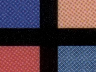
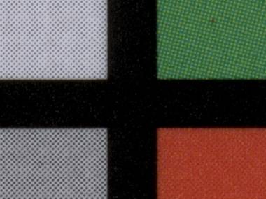
The most inexpensive color charts are obtained by offset printing, the color patches are not made from solid color pigments, but obtained using dithering and halftoning of the primary printing colors. The following close-up are taken from the The 2 in 1 checker, manufactured by Grey White Balance Colour Cards; you can see how the patches are obtained with dithering, in particular the second photo shows the grey patches on the left: they are made by a white background with black dots over it:
Color calibration using Darktable
Here we want to describe how to calibrate the colors of a photo using a color chart. We don't want to discuss how to create a color profile for a specific camera. The first is the process of calibrating a single shot taken under specific light conditions, with the aid of a color card inserted into the photograph. Se second is the process of creating a color profile to mimic the color calibration performed in-camera by each digital camera to obtain a good-looking JPEG image from the RAW data.
The entire process is made of five steps:
- Get a source image which includes the color chart. It must be converted in PFM (float) format and Lab color profile.
- Create a CHT file for your color chart (or get one already made).
- Create a CIE file (or get one already made) containing the color values of the swatches of the color chart. You must have the exact values, and the problem is where to get them! Alternatively you can provide a reference photograph of the chart, with properly calibrated colors.
- Using darktable-chart create a Darktable style, feeding the source image, the CHT file and the CIE one.
- Using Darktable, apply the style to all the photos shooted in the same light conditions.
The procedures described here were tested with Darktable 2.6.0 on a Debian GNU/Linux 10 Buster system.
Creating the Source Image
The source image is an image containing your color card. You need one for each scanning or shooting session made with the same light conditions and the same camera settings (at least as regards white balancing and ISO settings). The color card should appear roughly in plane with the camera, possibly non at the edges of the picture to avoid vignetting effect.
You need to convert the source image into the PFM (float) format and the Lab profile, because this is the format required by darktable-chart. We will use Darktable to make such conversion, but we need to enable Lab profile export, which is disabled per default. We need to modify the program configuration file, which in my Debian GNU/Linux environment is $HOME/.config/darktable/darktablerc. Open it and add the following line:
allow_lab_output=true
Now import the source image into Darktable using import from the left menu. View the image into the darkroom mode and verify its history (left menu): it should be only 0 - original. If you applied some modules on the image, remove them by selecting 0 - original and clicking compress history stack: every module above the one selected will be removed.
To be on the safe side you should define the input color profile. Still in darkroom mode, on the right menu, expand the input color profile section (you will wish to click the show only active modules button to find it easly). Select the most appropriate profile: for a regular JPEG image it should be sRGB, in my case - an image acquired with scanimage from a CanoScan 9000F scanner - it was linear Rec2020 RGB. Leave the gamut clipping to off. Once selected, verify the history where only two items should exist: 0 - original and 1 - input color profile.
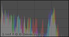
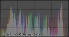
In the figures above you can see how the histogram looks like when choosing the wrong or the right color profile. An photo with shadows and highlights equally distributed, should present an equally distributed histogram, from left to right.
Return to the lighttable mode and choose export selected from the right menu, choose PFM (float) format and Lab profile. The exported file will be saved into a darktable_exported subdirectory. It is not required to add the output color profile module to the image history, just export with the options stated above.
Create a CHT file for the GWBCC Colour Card
A CHT file (scan recognition format file) is a text file describing the color chart shape; the file format is described in the page Description of the .cht format. Here we will describe a simple file for the 24 patches color card named The 2 in 1 manufactured by Grey White Balance Colour Cards company.
Here you can download an already made file: greywhitebalancecolourcard-2in1.cht.
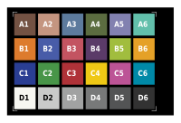 The chart is sized 140×88 mm, each patch is a square of 18×18 mm and there is a space of 2 mm between the patches. Into the CHT file we will use millimeters as the unit of measure, the coordinate system have the origin (0, 0) into the top-left corner. We will conventionally label the patches using four rows (from A to D) and six columns (from 1 to 6).
The first section of the file is introduced by the BOXES keyword:
BOXES 25
  F  _   _          5.0  4.0   125.0   4.0   125.0  84.0    5.0 84.0
  D  ALL ALL _ _  140.0 88.0     0.0   0.0     0.0   0.0
  Y  1   6   A D   18.0 18.0     6.0   5.0    20.0  20.0
Following the keyword BOXES there is the number of color patches and diagnostic boxes, 24 + 1 in our case.
The line introduced by the F letter defines four fiducial marks (reference marks at the four corners of the chart) used during alignment. They are defined by the X and Y coordinates of the center points, in clockwise order from top-left corner. There are two unused parameters after the F letter, represented by two underscores.
The line introduced by the D letter defines a diagnostic box. It will used just as a reference for alignment, it does not contain any color patch. In our case it represents the overall border of the chart. The first parameters are four arbitrary labels, then there is the box size 140×88, the following two parameters are the top-left coordinates of the box (the origin in our case). The last two parameters are both zero, because this box is a single, non repeated, entity.
The line introduced by the Y letter defines an array of rectangles, where each one is a color patch. There are four parameters defining the labeling system of the patches. Each box will have a label composed by two parts, the first part will identify the row (i.e. Y) position - infact we used the Y letter at the begin of the line, the second part will be the column position (the X). In our case the X ranges from 1 to 6, and Y ranges from A to D. So we have 24 patches labeled from A1 to D6. The next two parameters are the size of each color sample: 18×18 mm in our case. Then there are the top-left coordinates of the first color patch (6 and 5 mm in our case) and finally the distance from one patch and the other in column and row directions: i.e. the X and Y steps. In our case they are 20 mm each. If you need columns or rows growing in the opposite direction (right-left or bottom-top), you can use the proper coordinates for the first color patch and a negative step.
Then there is a section in the file with the BOX_SHRINK keyword:
BOX_SHRINK 2.0
This keyword tells to allow 2 millimeters of margin inside the patches: the colors will be sampled into a smaller box sized 14×14 instead of 18×18 mm. This will assure that only the patch color will be picked-up during the calibration procedure, avoiding to catch the black border due little image alignment errors.
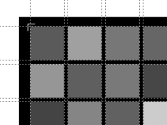 The next two sections of the file list the X and Y coordinates of the edges of the color patches. This should facilitate the automatic detection of the color chart patches inside the photograph (but we will see how to manually target the chart). The figure on the right shows - using dashed lines - the X and Y values that must be listed.
XLIST 12
    6.0 1.0 1.0
   24.0 1.0 1.0
   26.0 1.0 1.0
   44.0 1.0 1.0
   46.0 1.0 1.0
   64.0 1.0 1.0
   66.0 1.0 1.0
   84.0 1.0 1.0
   86.0 1.0 1.0
  104.0 1.0 1.0
  106.0 1.0 1.0
  124.0 1.0 1.0

YLIST 8
    5.0 1.0 1.0
   23.0 1.0 1.0
   25.0 1.0 1.0
   43.0 1.0 1.0
   45.0 1.0 1.0
   63.0 1.0 1.0
   65.0 1.0 1.0
   83.0 1.0 1.0
The last section of the file is introduced by the EXPECTED keyword. It will list the color coordinates expected for each color patch. We will use the CIE L*a*b* color space coordinates, because Lab is one of the most used color space used by professionals. Each color in Lab coordinates is expressed with three numbers, the first is roughly the lightness of the color, a floating point number in the range 0.0 - 100.0 (from black to white). The other two numbers express the color position on the green - red and on the blue − yellow axis. They are generally floating point numbers in the range ±100.0. The other color space used by consumer grade applications is sRGB, generally at 8 bit per color channel. In this system each color is expressed by three numbers (the Red, Green and Blue component) in the range 0 - 255 (8 bits).
Read the next section to learn how we determined the color values of our GWBCC color chart.
EXPECTED LAB 24
  A1   41.9   19.4   14.9
  A2   82.0   19.1   18.6
  A3   60.5  -17.4  -33.1
  A4   55.1  -16.8   28.5
  A5   66.1    1.8  -35.2
  A6   73.9  -38.2   -6.0
  B1   71.1   34.1   59.2
  B2   46.1    3.2  -52.4
  B3   61.0   63.0   16.0
  B4   34.1   23.1  -45.2
  B5   82.7  -19.1   66.8
  B6   78.0   19.2   66.8
  C1   38.1    7.9  -57.1
  C2   63.2  -45.5   27.3
  C3   55.1   71.0   40.3
  C4   89.0    0.6   80.4
  C5   58.8   65.1  -16.1
  C6   63.6  -22.7  -37.6
  D1   94.9   -0.1   -2.4
  D2   86.9   -0.6   -6.0
  D3   75.2   -1.3   -6.8
  D4   53.5   -0.8   -7.7
  D5   35.5    0.2   -8.9
  D6   19.9    1.6   -7.3
The EXPECTED keyword is followed by LAB, to indicate that the color coordinates are Lab ones; the number states how may lines will follow. Then, for each color patch, there is the label and the three L*a*b* values. The colors expressed here are just for reference: rectangles with a colored border will be displayed in darktable-chart during image alignment, and you can use the color as reference for proper image alignment and orientation. Color values for actual calibration are read from a .CIE file or from a reference image.
Create the CIE file with color values of the GWBCC Colour Card
Here begins the most complicated part of the process: you need to know what exact colors are printed on your color checker chart, so that the Darktable software will be able to exactly calibrate your photos or scans, by just comparing how the colors looks like into your captured image, and how they actually should look.
You can think that the manufacturer of the checker will give you that color values. This is quite true for well-known manufacturers. For example X-Rite declares the color coordinates of the patches and it guarantees that the colors are consistent in the production lots. Other manufactures do measuring on each production lots, and they provide some documentation with the product, assuring the color quality and consistency.
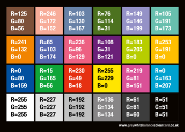
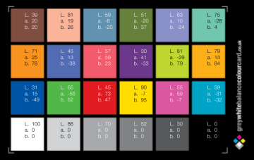
This is not the case with GreyWhiteBalanceColourCard.co.uk, their products are offset printed, which is not guaranteed to give adeguate consistency. Probably also the printing substrate and the inks are not consistent enough to provide precise values to their customers. So I got only very rough and inconsistent values from two sources: the first source is the Colour Card User Guide 2nd Edition which, at page 48, has a table of RGB 8bit values. The other source is a PDF document I got directly from the GWBCC support, where there are the (supposed!) L*a*b* values. Here you are the two tables:
Figures above: color values provided by GreyWhiteBalanceColourCard: just useless crap!
As you can verify, the color values in tables are quite inconsistent each other (I used the Color Picker into the GIMP software to compare RGB and L*a*b* values), where the most prominent problem is the bottom-right black patch, which is a 21% gray in RGB table, but it is 0% (i.e. pure black) in the L*a*b* one. In the actual printed color checker that I have purchased, the D6 patch is (very roughly and empirically) something like a 17% gray. The D1 white patch is declared to be a 100% white, which is rather an oddity in color checkers, because to be so, it should reflect 100% of the illuminant. Just for reference, the X-Rite ColorChecker has the white patch at 95%, my empiric measure on the actual GWBCC chart is a white at about 91%.
To add confusion to confusion, the ColourCard FAQ says that their products are set to match the Macbeth colours, which is quite a vague sentence. X-Rite (the current manufacturer of the Macbeth ColorChecker) publish the RGB and Lab values of their products (manufactured before Nov 2014 and after Nov. 2014); unfortunately the values are not the same of GWBCC ones.
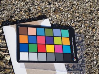 So what is the best and quickest empirical method to measure the color values of your card? I just put my GWBCC copy in the midday sunlight, of a clean day, away from color-reflecting surfaces, and took a photo with a good camera, hoping that it did a good job in color balancing, exposure, etc. I took several photos at different exposure values, ranging from -1.0 to +1.0 EV, and used the one that best matches the colors on my monitor and to my taste.
I choosed the photo shot at +0 EV because it seemed the best for color fidelity. Then I decided to increase a bit the luminosity because the white and the black swatches (actually white and dark gray) seemed too dark. Infact, using the The GIMP's Color Picker Tool I measured the CIE LAB L* color component (i.e. the luminosity), they resulted about 91 and 17 respectively, wheras the X-Rite Color Checker has them at 95.19 and 20.64. I used the Imagemagick convert tool to increase the luminosity using a polynomial function:
convert gwbcc-reference-photo.jpg -function polynomial '1.025,0.020' gwbcc-reference-adjusted.png
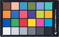 The first coefficient of the function is the slope (increase it to lighten the white), the second coefficient is the offset (increase it to lighten the black); to have a null transformation use 1 and 0 respectively.
Still with The GIMP I used the Perspective Tool to rectify the image back in rectangular form and the Crop Tool to get only the interesting part. That image can be used directly as the reference in darktable-chart, but if you want a more numerical approach, you can use the Color Picker Tool along with the Use info window (Shift) option to read the average L*a*b* color coordinates of each color swatch!
Here you can download the already made file: greywhitebalancecolourcard-2in1.cie. The format of the file is self-explanatory: the keyword NUMBER_OF_FIELDS states that there are four values for each line, the first is the label SAMPLE_ID, then there are the three Lab coordinates LAB_L, LAB_A, and LAB_B.
Use darktable-chart to create a Darktable style
Now that we have a source image and the reference values, we can start the darktable-chart to create a Darktable style that can be applied whenever an image is acquired in the same source conditions.
The source image
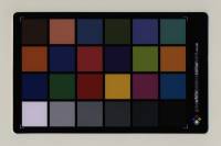 Click the image button to load the source image. In my case the source image was an image of the GWBCC color checker acquired using a CanoScan scanner. It was acquires on GNU/Linux using scanimage. No ICC profile was applied, so it looked very dark. That image was opened in Darktable and the linear Rec2020 RGB input color porfile was applied. Then the image was saved in PFM (float) format and Lab profile, as explained above.
Then click the chart button and load the CHT file describing the color chart. Now you have to align the edges of the chart over the image, unitll they matches exactly. Use the size slider to shrink the swatches, so you are sure not to get the black borders.
The reference values
Click the reference values tab of darktable-chart. Here you can click the reference it8 button and load the CIE file of the chart. Alternatively you can load one calibrated image of the chart, but you have to convert it into PFM (float) format and Lab color profile.
process
In the last step you have to define the number of final patches, i.e. the number of color points that will form the color lookup table. Starting from 24 (the number of color patches of our color checker), we click the process button and check the resulting values for average dE and max dE, they should become zero. I had to increse the number to 26 patches to obtain zero average dE (and consequentially zero max dE).
Applying the style in Darktable
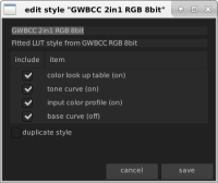
Start Darktable, in lighttable mode you have the styles section on the right, click the import button and select the .dtstyle file you created above. The style created in darktable-chart is composed of several modules, you can view them clicking the edit button once selected it:
| Color lookup table | The color lookup table is the most important one because it is responsible of exact color matching; it works using source and target points and splines interpolation. |
|---|---|
| Tone curve | The tone curve is used mainly to match gray scale gradation. |
| Input color profile | The input color profile can be used to override Darktable's automatic allocation of input color profile. The one included by darktable-chart into this style produces the error [colorin] could not find requested profile `standard color matrix'!, which has the nasty effect to apply the sRGB one, actually messing-up all the colors. So you have to remove this module and replace it with the most appropriate one. In my case - apply the style to images acquired from a scanner - I had to replace this module with the linear Rec2020 RGB one. |
| Base curve | The base curve module is added but in the off state, because the more powerfull tone curve is used. |
As said above, the style created by darktable-chart was not usable as-is. The problem was that my source images (the one used in color calibration and the ones that need color balance) did not have a color profile that Darktable can detect, neither the generic standard color matrix embedded into the style was good. So I followed these steps:
- Import the image you want color balanced and check its history in darkroom mode; you should remove any modules eventually applied to it. Be sure to apply the correct input color profile: as said above, the image I got from the scanner requires linear Rec2020 RGB, but your case my vary. The color profile is applied acting from the modules list on the right, and it should then appear into the history on the left.
- Apply the style imported from
darktable-toolto the image: in lighttable mode select the image, expand the styles menu on the right and double click the style name. - In darkroom mode compress the history stack of the image to remove the base curve (which indeed was off) and the bad input color profile. Only the tone curve, color lookup table and the original input color profile should remain.
- Return into lighttable mode, into the styles section create a new style which will contain the history of the selected image. This is the only one that you will apply to all the other images.
The style created by darktable-chart is actually an XML file. You can open it with a text editor to remove the unwanted modules (the disabled basecurve and the bad colorin). Unfortunately it is not easy to manually change the colorin module, because data into the XML file is gzipped and base64 encoded:
  <plugin>
    <num>1</num>
    <module>4</module>
    <operation>colorin</operation>
    <op_params>gz09eJzjZqAfYIHSAAWQABA=</op_params>
    <enabled>1</enabled>
    <blendop_params>gz12eJxjYGBgkGAAgRNODESDBnsIHll8ANNSGQM=</blendop_params>
    <blendop_version>7</blendop_version>
    <multi_priority>0</multi_priority>
    <multi_name></multi_name>
  </plugin>
An Example Image
Here it is an example of what I obtained with the above workflow. The first image is what actually was acquired from the scanner. No particular color space was associated to the image, so if we open the image assuming the sRGB color space we get a very dark image (the histogram is unbalanced toward the dark tones):
Raw image from the scanner. If no specific color space is declared, sRGB is assumed (but it is wrong).
Applying the linear Rec2020 RGB color space (just declaring it, without actually changing the pixel data), we get a better image; even the histogram is more balanced between dark and light tones:
Using Darktable, the Linear Rec2020 RGB color space is applied.
The final image is just the raw one with the style applied. A quite good result considering that no manual adjustment was made!
The image after applying the Darktable style.
Creating a picture of a color chart
Having a reference picture (with exactly calibrated colors) of your ColorChecker can be very useful. A ColorChecker reference image can be used as a comparison with images acquired using a scanner or with photos taken in some light conditions: just include the actual ColorChecker into the scan or into the photo and calculate the transformation functions to obtain the same color tones of the refrence picture with a suitable software (e.g. Darktable).
Surprisingly enough, it is not easy to find or to create such a picture. X-Rite publishes the document ColorData-1p_EN.pdf (here a local copy), where the reference colors are defined with enough precision in the CIE L*a*b* color coordinates; unfortunately the RGB equivalence is expressed with only 8 bits per channel. On the internet there is available a wonderful paper (produced by the BabelColor Company) with the title RGB coordinates of the Macbeth ColorChecker (here a local copy); it reports the official Macbeth RGB values expressed with 16 bit per channel, it also reports the measures of the actual color tones (avaraged on several actual ColorChecker cards) expressed in the same RGB 16 x 3 bit coordinates.
Beware that the above data refers to ColorChecker manufactured before November 2014, after that date some changes were introduced, perhaps due the necessity to comply with toxicity law in color pigments. For X-Rite ColorChecker manufactured after november 2014 there is the official color coordinates provided by X-Rite released in October 2015, but they are only in L*a*b* coordinates.
Another problem in creating ColorChecker images is the poor support for L*a*b* color space and 16 bit/color in image manipulation applications. Using the GIMP you need at least version 2.10 to open 16 bit TIFF images; you will have a color picker that shows you color coordinates in sRGB 16 bit integers and L*a*b* floating points, but you are still limited to enter color coordinates using the 0-255 or 0-100 ranges.
So here there are three reference images (ColorChecker simulations), created from three different datasets. They were downloaded from the page The ColorChecker Pages, ColorChecker images, which contains all the details, plus other images in different color spaces:
- ColorChecker sRGB image Macbeth Lab
Created from GretagMacbeth L*a*b* D50 data, for charts manufactured before Nov. 2014. - ColorChecker sRGB image BabelColorAvg
Created from BabelColor data, average of 30 charts manufactured before Nov. 2014. - ColorChecker sRGB image X-Rite AfterNov2014
Created from X-Rite L*a*b* D50 data, for chars manufactured after Nov. 2014.
Web References
- The ColorChecker Pages by BabelColor.
- RGB coordinates of the Macbeth ColorChecker, June 2006 update (downloaded from here).
- ColorChecker RGB and spectra, XLS data, April 2012 update (downloaded from here).
- ColorChecker24 After Nov2014, October 2015 (downloaded from here).
- Scan Recognition Format File (.cht), description of the .cht format.
- GWBCC User Guide (downloaded from here).
- GWBCC Questions and Answers (downloaded from here).
- X-Rite ColorData - 2009 (downloaded from here).
- X-Rite ColorChecker24 sRGB and Lab values, for products before and after Nov 2014 (from here).

